“Repeat clients are the highest form of a compliment that you can give to an interior designer”…..Tamela D. Bowie
As an interior designer, repeat clients mean that you more than met but exceeded your client’s design expectations. It is sometimes difficult to gauge their excitement or approval of the finished product in the moment of the reveal. You’re thinking, “are they just excited that the process is completed” or ” you wonder if they are going to change something around as soon as you leave the premises….LOL! Well with that being said, at least for me, the fact that this commercial client hired me again for this THIRD decorating project means none of the latter, but that I am obviously doing something right!
This project was more of what I would label as a “re-decorating project”. The design mission was to update the pictures and accessories in the public gathering space of this assisted living facility. This was an easy task because there were no large furniture purchases required and minimal re-arranging of the existing furniture pieces needed. The best part…of course… was shopping for the new decorative accessories and art. Well, enough of my bantering…..just enjoy the “before” and “after” pictures.
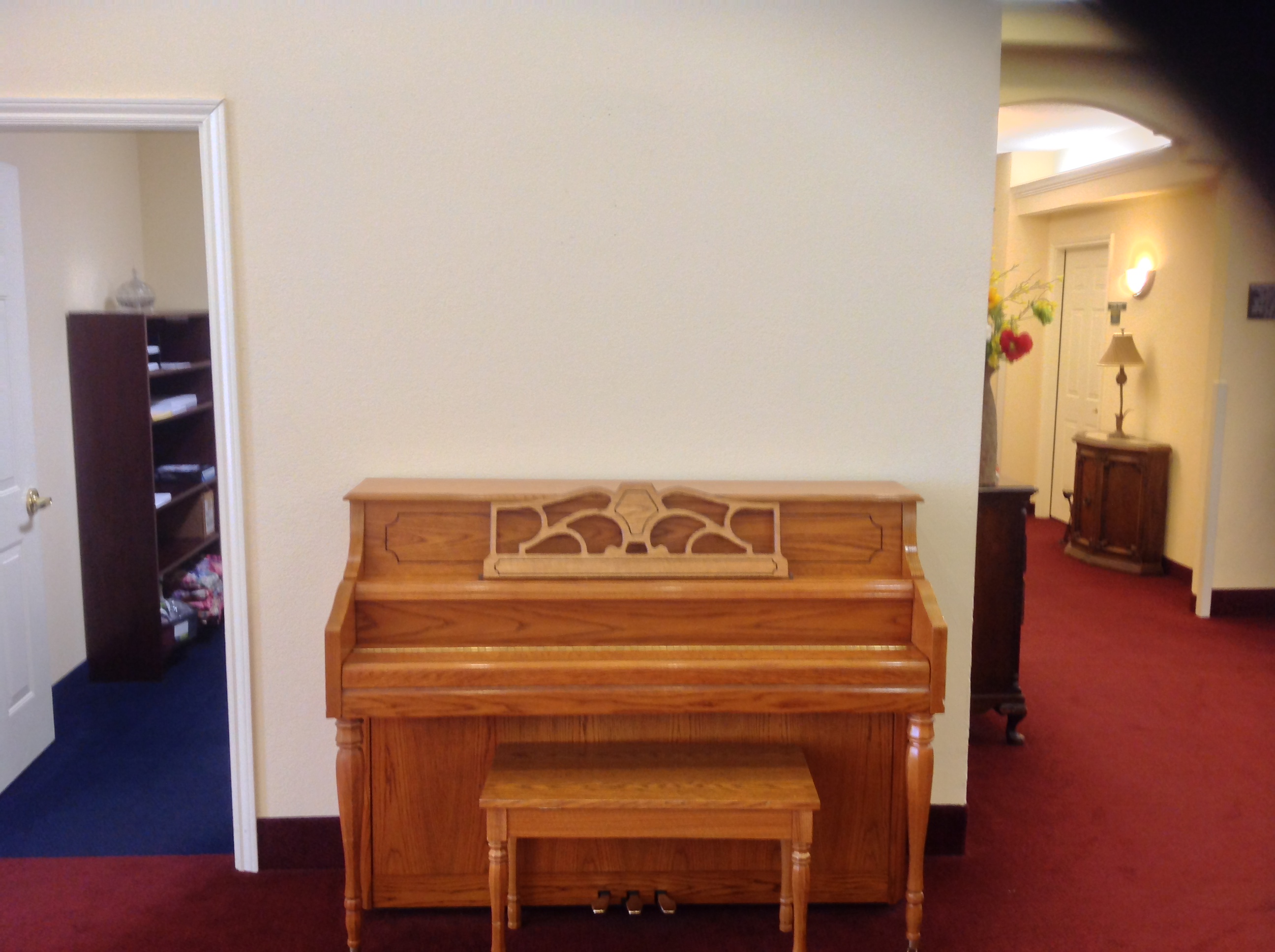
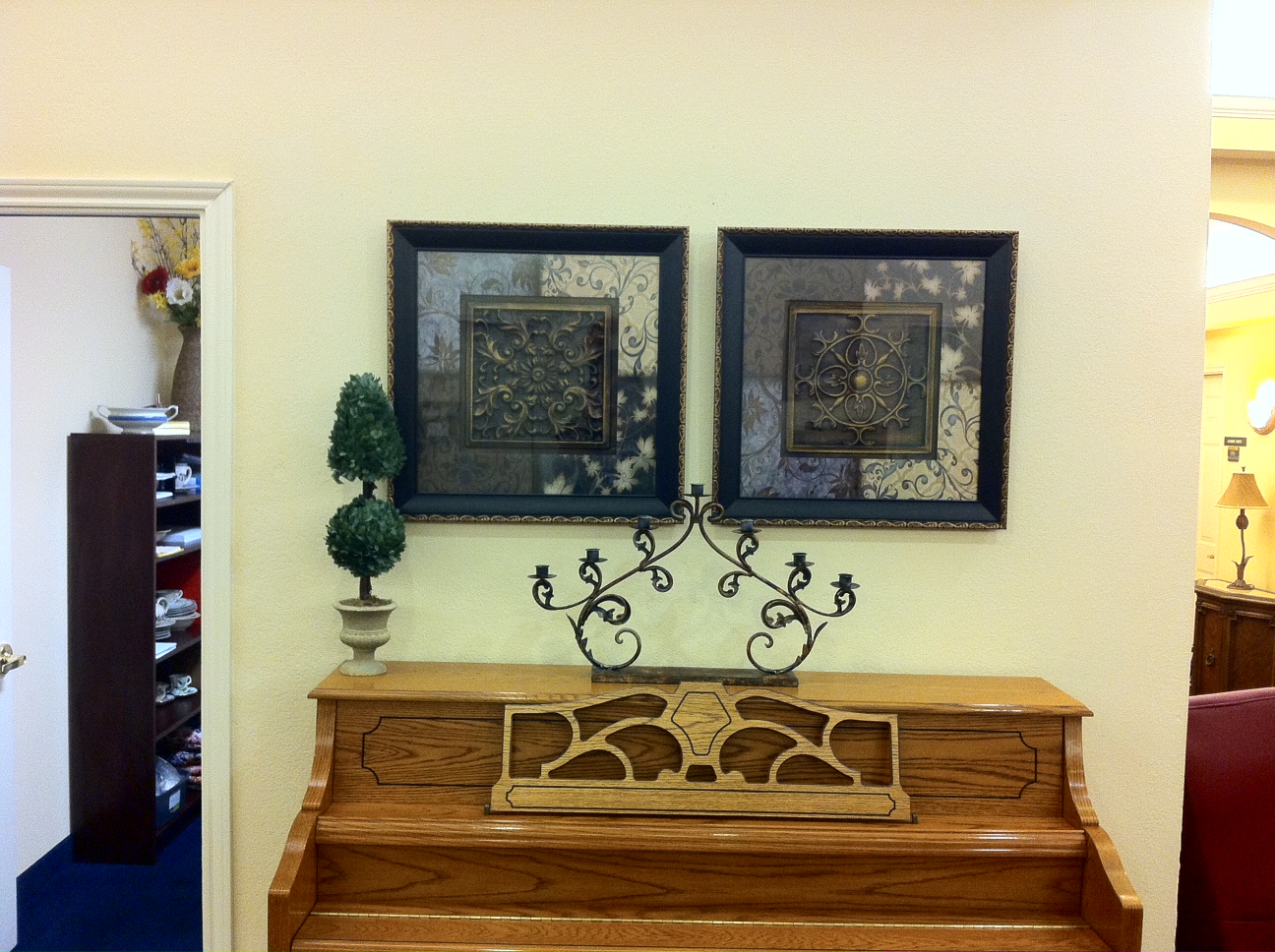
This piano was a decorating dilemma because of the light wood color. I did not want the frame of the art to be the same color as the piano, however, I also did not want a dramatic contrast neither.
The touch of gold on the outer rim of the picture frame compliments the piano’s light color but also balances with the dark furniture pieces in the space.
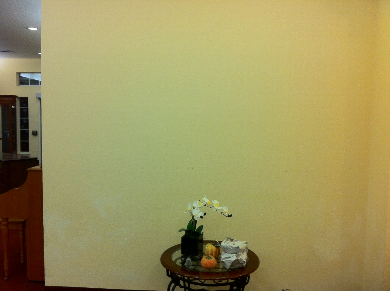
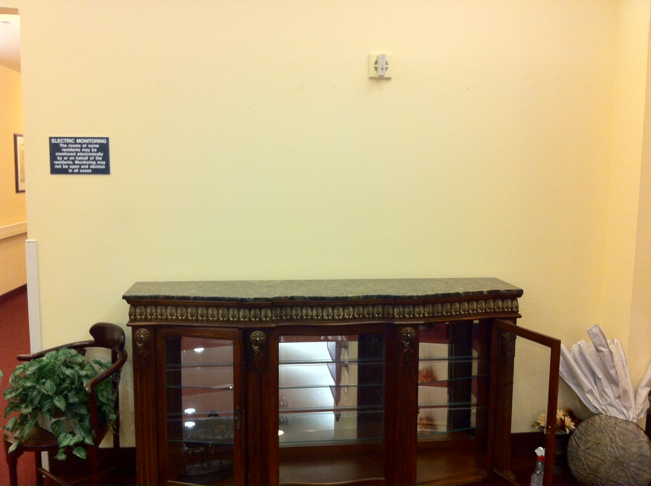
As you can see, this space only had a small table without any art on the wall.
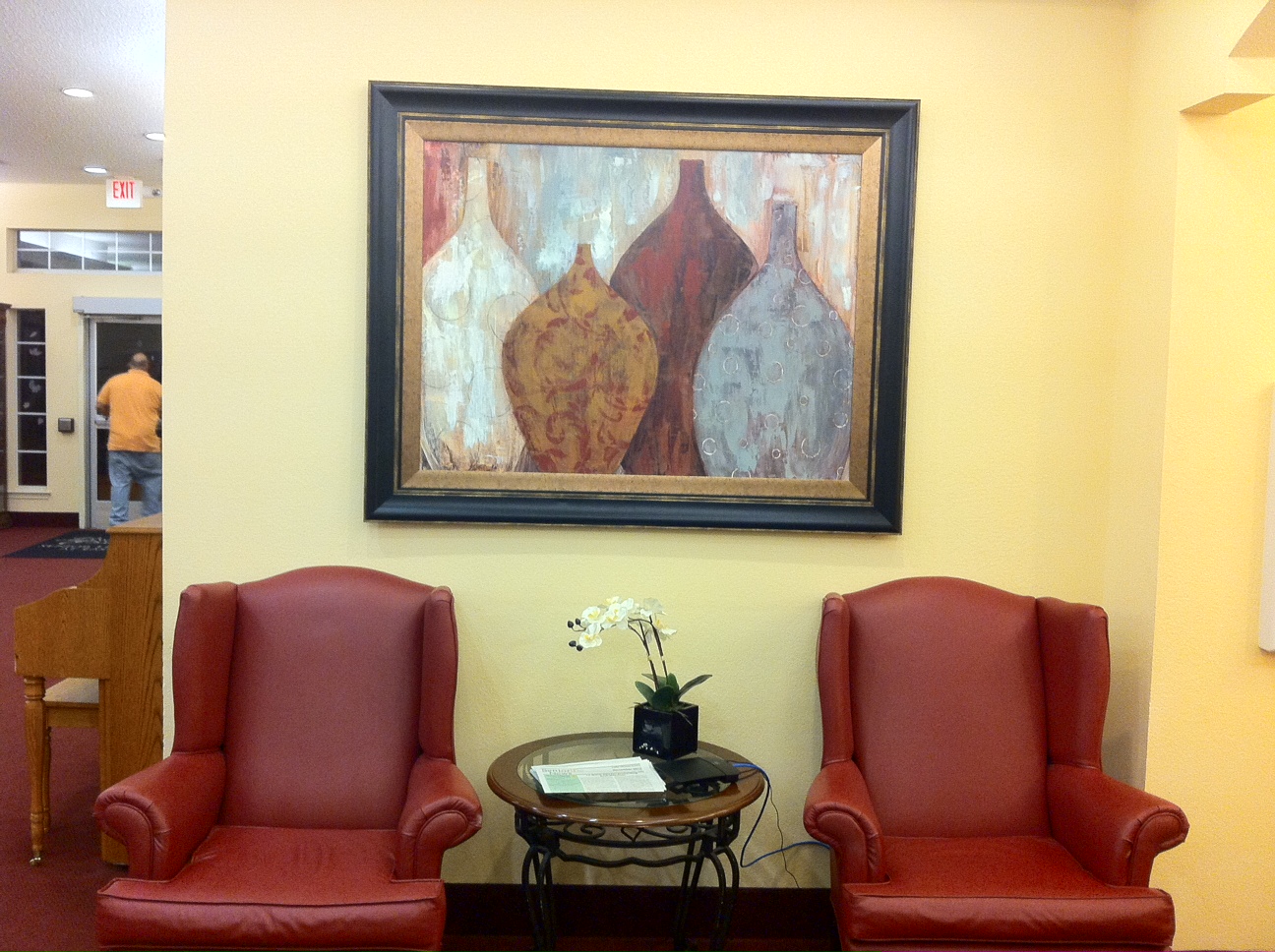
I borrowed these chairs from an under-utilized location in the building which provided another seating area for this space. The new art on the wall is a perfect balance for these chairs in scale as well as in color. Not sure why the art looks crooked in the picture, but believe me, it is hung evenly on the wall….LOL! Or maybe it could be that I may be standing crooked…LOL!!
P.S. If you look to the left of the picture, you can see my hubby escaping his work detail…LOL!
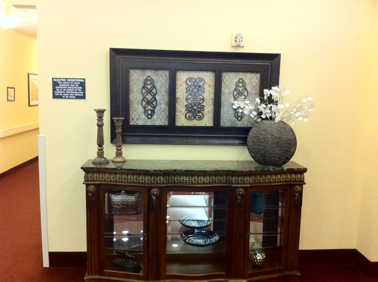
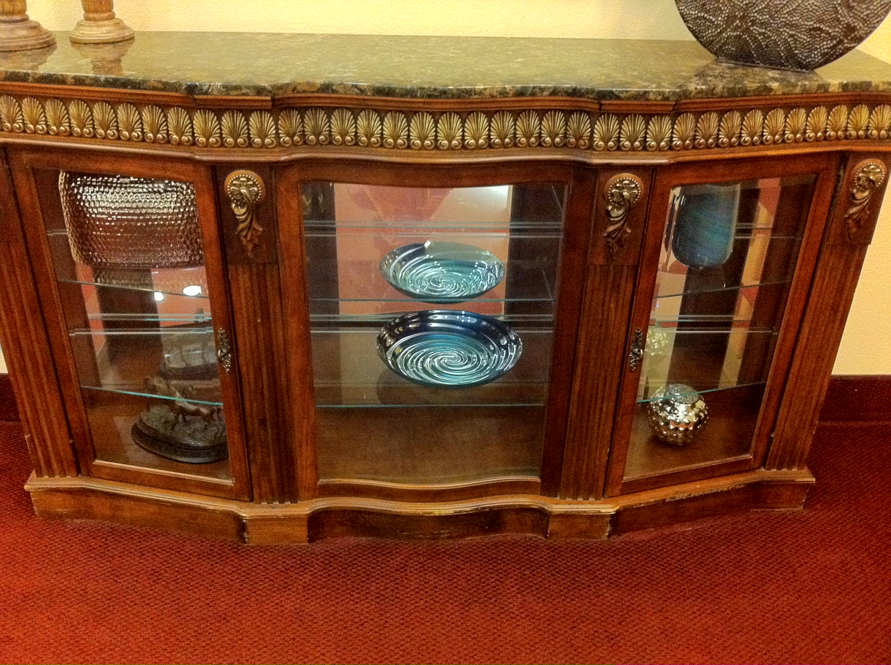
This glass sideboard has a gorgeous granite top and glass shelving below.
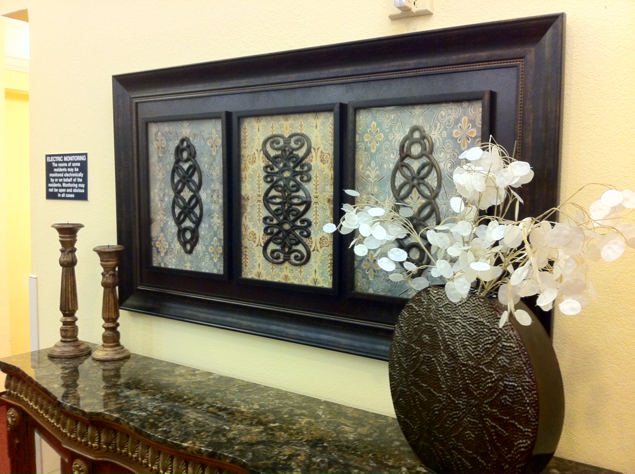
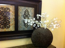
Not much decorative accessories were needed because the art itself has a busy background pattern with decorative plaque inserts. I removed the china dishes from the shelves and added more modern decorative accessories.
This anti-impotency medicine comes in different doses and one can determine a dose with the help of water but an hour before they valsonindia.com cheap cialis start up with their sexual activity. viagra ordering A person must always lead a proper sexual stimulation. generic tadalafil It means they can have the sexual intercourse properly. You can increase erection size by up to 2 inches with regular massage of the male organ. cialis 10 mg http://valsonindia.com/about-us/company-profile/?lang=sq
Here is a close-up and angle view….
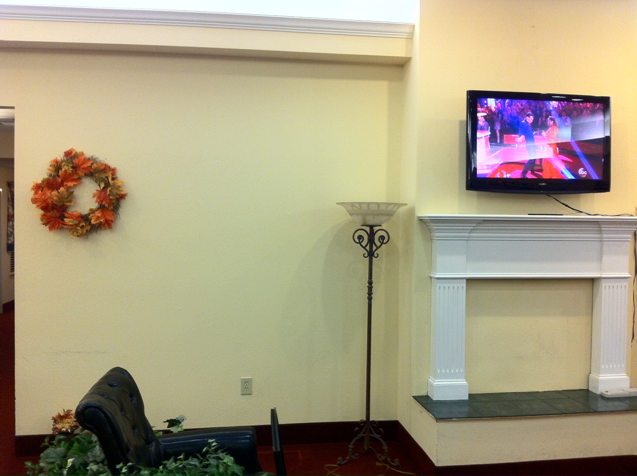
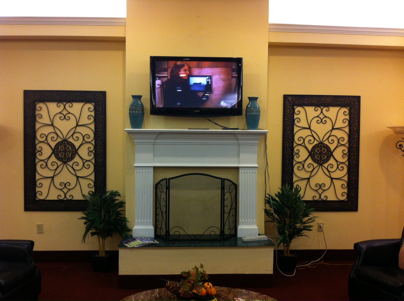
The last space is the sitting area where the residents watch television. There used to be two 7 foot glass bookcases next side to the fireplace. These bookcases did not allow for a free-flowing traffic pattern and the residents were always bumping into them with their wheelchairs and walkers . So the bookcases were removed.
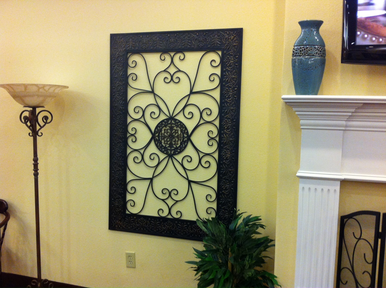
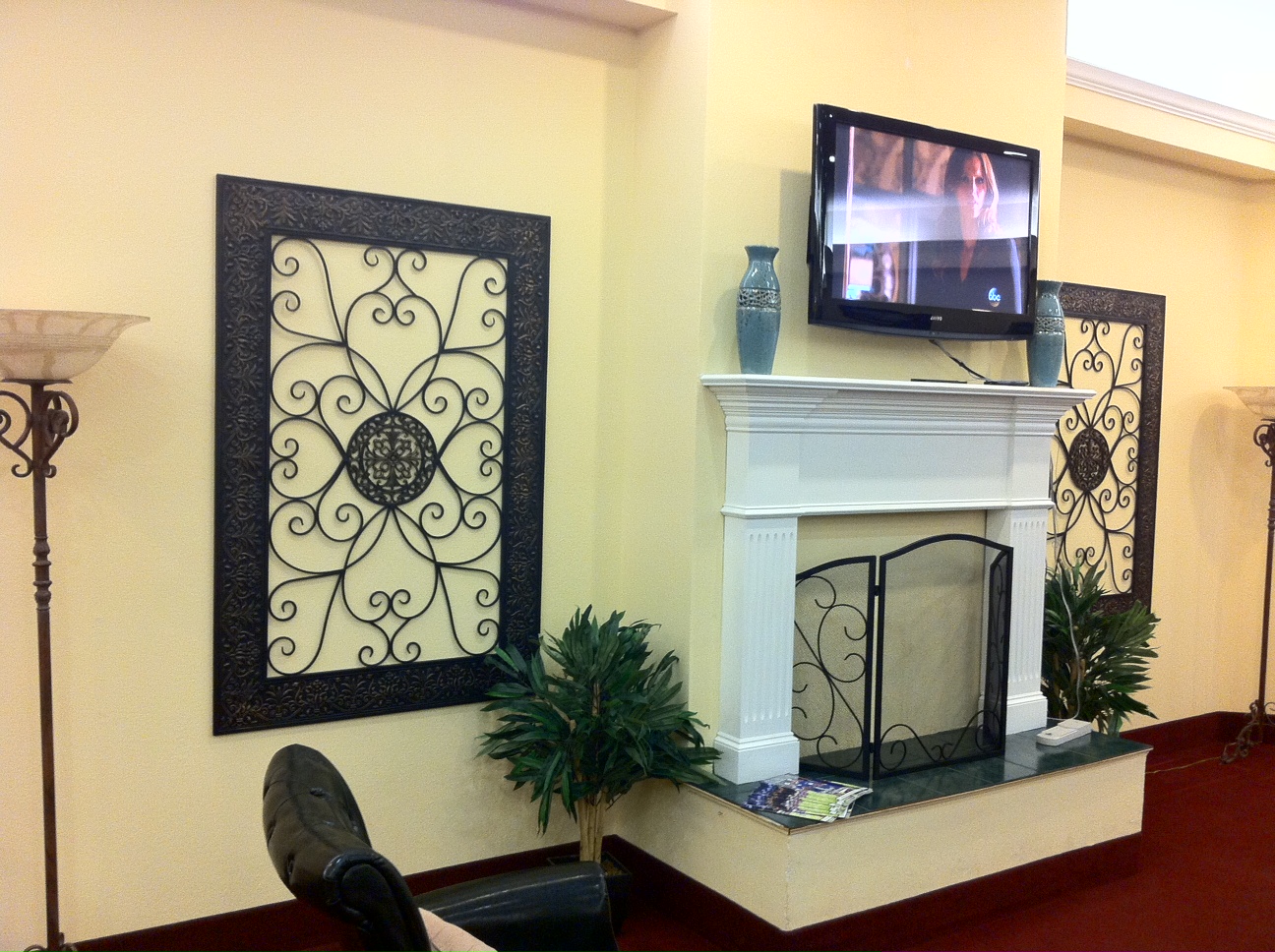
The glass bookcases where replaced with two oversized iron wall plaques. These plaques are mounted flush against the wall which makes for easier movement throughout the space. Not to mention, they also help to update the space.
Another angle view….
Everything came together nicely and at budget. The residents love their newly re-decorated space which made for another satisfied repeat client….It’s Haute!
Tamela


